

Improve Your Data Visuals: Stock Prices and Midterm Elections
- Brent Jones

- Nov 6, 2018
- 2 min read

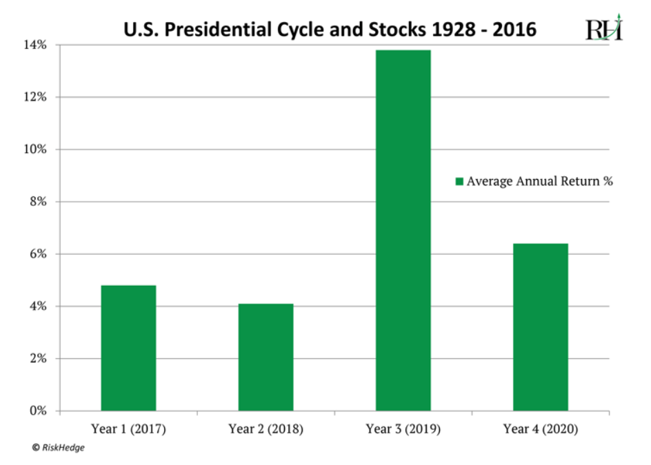
I recently read an article by RiskHedge.com where they compared stock prices with presidential terms. I'm not big into politics, but I am a small investor so I found the two being analyzed together rather intriguing.
Some of their key findings:
Since 1946, stocks have jumped an average of 17% in the year after midterm elections.
Stocks in the third year of the president's term beats all other terms.
But for this blog, I want to talk about the chart they used and how we may improve upon it:
The Title Can Be Improved
The graph does do its job at displaying data. However, it did take me more than a couple of seconds to understand it. One of the reasons for this I think, is that perhaps the graph's title doesn't effectively describe what's going on.
The chart is not about presidential cycles; it's about stock increases. So, I think having the word "Stock" before "Presidential" will provide some extra clarity. I would change it to read:
Avg Stock Increases and Presidential Terms (1928 - 2016)
The Labels Can Be Improved
The x-axis labels are confusing. The title shows 1928 - 2016 but the x-axis is showing 2017 to 2020. I think the author is wanting to point out that (as of this writing) 2019 is coming up, so we should buy or hold onto stocks. Considering this, I would rename the labels to just "Year 1", "Year 2", etc.. We can use a callout on year 3 to inform our audience that year 3 is coming up. The legend is also redundant and only serves as mental clutter. Let's remove it.
So far I've:
Changed the title.
Renamed the x-axis.
Removed the legend.

Remove the Clutter!
Next, I'll apply some more storytelling techniques to refine the chart and remove clutter.
Gridlines tend to cause clutter, but we can reduce the impact by making it a lighter shade of color.
Move the title to the left hand side. Give it some room as well.
Use color to draw attention to year 3 and add the callout.
Remove any borders.
Add x and y axis titles.
I think this graph conveys more information and has a bigger impact for the reader while avoiding information overload. There's an obvious area of the graph to look at, and the message is clear: "The 3rd term has the highest returns".

Alien Tip: Gridlines or data point labels?
Unless you absolutely need it, you should only have one or the other - not both. Having both leads to clutter and redundancy.
Power BI
I created the above graph with Power BI. To read about some of the techniques you can use to achieve the same result, check out my other post, Storytelling with Data and Power BI.
I hope you enjoyed this read. Cheers!
To learn more about storytelling and visualizations, I would highly recommend "Storytelling with Data" by Cole Knaflic.


Comments