How To Make a Mekko Chart in Power BI
- Brent Jones

- Sep 18, 2024
- 3 min read
In this post, I will describe how to make a mekko chart in Power BI. This is a clustered variable width column graph.

As of this writing, Power BI does not have any native mekko chart visuals. There are a couple really nice third party visuals that you can download from the appsource, however these require you to purchase a subscription. They are not expensive so if your organization gives you the OK, go for it! If you're like me, though, and your organization will not allow third party visuals, there are some workarounds to build a visual that looks quite similar.
How to make a mekko chart in Power BI
For this example, the goal is to create a chart that shows:
Year-over-year sales growth % on the y axis.
Product brand on the x axis.
Width of the column (product brand) is based on a % of total yearly budget.
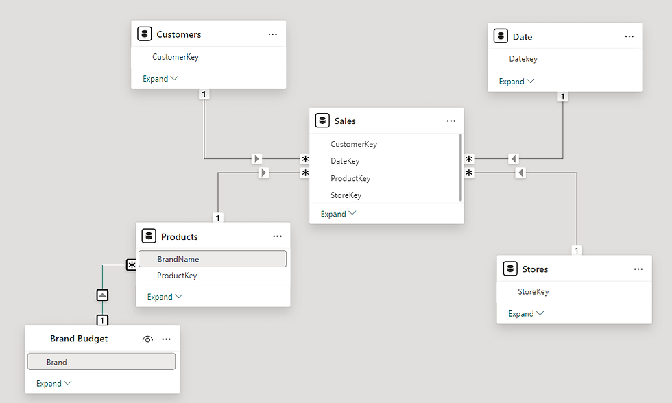
I'm using the standard Contoso semantic model, with one additional table to hold the budget.

Step 1:
Create a disconnected table for the column width.
This table will be used on the x axis of our visual, and will allow us to achieve the variable width of the column . Because the axis is based on a percent of total budget, values should range from 0 to 100 percent. You can build this with Power Query or DAX, but the below code is how you can quickly build it in DAX.
Budget Series = GENERATESERIES( 0, 1, .01 )Step 2:
Prep the budget table.
The budget table needs to have a column for sort order and an accumulated budget. The sort order column will be used to calculate the accumulated budget, and the accumulated budget will be used in step 3 below. To create an accumulated budget column, we can use the following DAX code:
Accumulated Budget =
VAR CurrentRow = 'Brand Budget'[Sort Order]
VAR AccumulatedBudget =
CALCULATE(
	SUM ( 'Brand Budget'[Budget] ),
	REMOVEFILTERS ( ),
	'Brand Budget'[Sort Order] <= CurrentRow
)
RETURN
	AccumulatedBudget
Note: this is a calculated column! Not a measure!

Step 3:
Create a measure based on budget axis.
We need to create a special measure for the metric you want to use on the y axis. The idea is that for each x axis value (the budget % ranging from 0 to 100) that falls within the product brand budget, return the y axis value (sales growth). The DAX measure will be as follows:
Brand Sales Amount by Budget =
VAR XAxisValue =
	MAX ( 'Budget Series'[Value] )

VAR BrandBudgetEnd =
	SELECTEDVALUE( 'Brand Budget'[Accumulated Budget] )

VAR BrandBudgetStart =
	BrandBudgetEnd - SELECTEDVALUE( 'Brand Budget'[Budget] )

RETURN
	IF (
		XAxisValue <= BrandBudgetEnd
			&& XAxisValue >= BrandBudgetStart,
		[Total Sales]
	)
Step 4:
Add an area line chart to the canvas and add the following:
X axis <- 'Budget Series'[Value]
Y axis <- [Brand Sales Amount by Budget]
Legend <- 'Products'[BrandName]

Step 5:
Change the line interpolation from linear to step. And viola! We have a "mekko" chart using only native Power BI visuals. Of course, there are some drawbacks. Data labels are hit-and-miss due to the nature of a line chart. And interactivity is degraded because, again, the nature of a line chart.

Budget By Brand and Year
In the example above, I only had a budget amount for the brand. But typically you would want this broken out by year as well. Say like this:

There are a couple of paths we can take to accommodate the addition of years. But for this example, I will opt for the simpler solution of modifying the measure (modifying the model to accommodate the year has the risk of introducing ambiguity into the model).
Incorporate the year into the measure
Inside of our measure, we need to capture the year in the filter context, and apply that as a filter to the budget's table. We can accomplish this as follows:
Brand Sales Amount by Budget and Year =

VAR CurrentYear = MAX ( 'Date'[CalendarYear] )

VAR XAxisValue = MAX ( 'Budget Series'[Value] )

VAR BrandBudget =
	CALCULATE(
		SELECTEDVALUE( 'Brand Budget'[Accumulated Budget] ),
		'Brand Budget'[Year] = CurrentYear
	)

VAR BrandBudgetStart =
	BrandBudget -
	CALCULATE(
		SELECTEDVALUE( 'Brand Budget'[Budget] ),
		'Brand Budget'[Year] = CurrentYear
	)
RETURN
IF (
	XAxisValue <= _BrandBudget
		&& XAxisValue >= BrandBudgetStart
		&& XAxisValue > 0,
	[Total Sales]
)
Notice that we need to include an additional condition for XAxisValue > 0. Not having this condition will show each of our categories on 0%, which is an unwanted side effect of including Year in our visual.

I'm sure there are other ways of building a mekko chart within Power BI, maybe even using calculation groups. Or maybe Power BI will release an update that has a mekko chart. Until then... cheers!


Super interesting.... Unfortunately the dataset in the PBIX file is missing the chart Brand Budget. Any hope to get it (or procedure to generate it) ? Bests, A.